Sentiment analysis of automotive Tweets
The automotive industry is a multi-billion dollar company relying on positive business-client relations. With so much at stake, it is critical for these types of businesses to monitor and protect their online reputation. One way of obtaining social media data about companies is to monitor Twitter data and use the machine learning models to calculate the sentiment of the tweets. It has been shown in other work that in fact the sentiment of these tweets is correlated to the movement of the stock market.
In this blog post, we outline the methodology that was used to build a machine learning sentiment classification model, as well as the infrastructure to collect, process and store live twitter data. This was followed by some exploratory data analysis where we used topic modeling to filter irrelevant topics. Finally we used the CAP model to study the possible influence of the twitter sentiment signals calculated by the machine learning model on the return of the stocks and provide the results of the analysis.
I would also like to note for those interested readers that MonkeyLearn has written a great article that introduces the ideas of sentiment analysis aswell many business user-cases.
In this work five automotive brands are examined: Tesla, Ford, Toyota, Mercedes and Porsche. The focus of this post is to outline the mathematical and statistical analysis methods, as well as to set up the computational infrastructure needed to undertake such a study of tweet sentiments and financial returns. In a follow up post, we will focus on the analysis of a large data set to robustly quantify and analyse the trends observed in this work.
Contents
-
Sentiment analysis model
a. The Threshold of the Ensemble model -
Preliminary Results
a. Combining the sentiment curves
b. Analysing stock returns and sentiment signals
c. Posteriors of the correlations
Sentiment Analysis Model
The natural language model that we used in this project was the Bag-of-words model (BOW). Using a large corpus of documents, all occurring words are analysed and ranked from most to least frequent. Then a function is used that maps a given sentence to a vector representing the occurrence of words from the vocabulary in the sentence.
More sophisticated language models exist on the market, however, as shown in Ref. 1, the simple BOW model is already capable of achieving about an 80% accuracy in sentiment identification problems, making it a good initial model for this pilot study.
Based on this BOW model, we generated feature vectors of the corpus in the training set that consisted of amazon reviews, yelp reviews, and the sentiment140 data set. These feature vectors and their corresponding labels were used to train two binary classification models, the logistic regression (LR) and naive Bayes classifiers (NB).
While more sophisticated sentiment classifier models exist, we chose to use these simpler approaches. This is because the LR and NB classifiers both provide probabilities in their categorizations that will be used as uncertainty estimates. It was indicated by Max Margenot that a sentiment classifier model based on logistic regression achieved about a 78% accuracy, while a more sophisticated LSTM neural network scored about 81.5% on the sentiment140 dataset and took significantly longer to train. This indicates that the NB and LR are sufficient for this task.
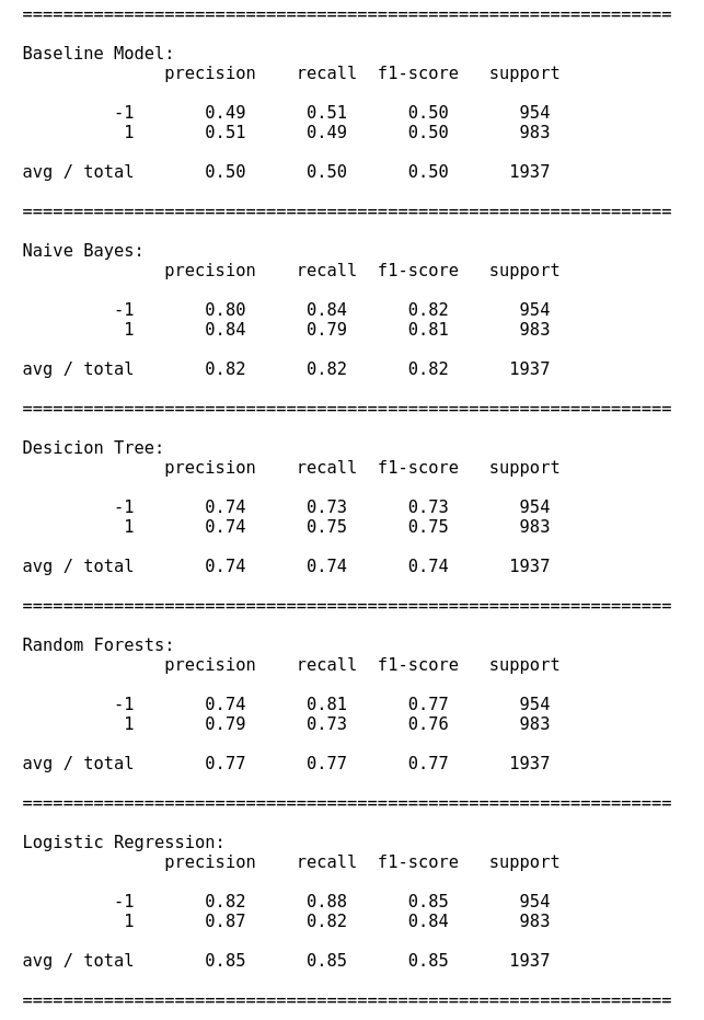
In Fig.1, we provide the training scores of the different sentiment classifier models that were tested. The training data was split into training and testing (80/20 %) split. The LR and NB models both scored well on accuracy and recall.
Model Threshold
Once the two models were trained the final model used consisted of an ensemble of the LR, NB and pre-built textblob (denoted as TB) classifiers. The output of the ensemble model was the sentiment that corresponded to the classifier that had the greatest confidence in the result. Furthermore, we added the constraint that required the ensemble model to only make predictions if the confidence of the model was larger than the input threshold value \(T\). The mathematical description of the model is \(\text{Prediction} = \text{max}\lbrace \text{Pred}(\text{LR}),\text{Pred}(\text{NB}),\text{Pred}(\text{TB}) \rbrace,\)
with the condition that
\[\text{Prob}(\text{Prediction}) \geq T.\]This threshold value was varied from 0 (predictions made with 0% confidence), up to the value 1 (100% prediction confidence).
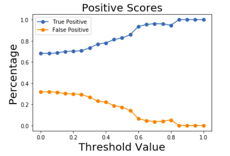
In the above Figure the fraction of true/false positive predictions for a test data set is plotted as a function of the threshold. As the threshold increases, the number of tweets identified as positive increases while the false positives decrease as expected.
Data collection and cleaning
With the model in place, the next step of the project was to collect twitter data based on keywords related to the car brands that were examined. The keywords used in this study were
- keywords: daimler; BMW; mercedes benz; toyota; ford; tesla; porsche.
We used the twython library which allowed us to listen to live twitter feed based on the above keywords.
An AWS EC2 server was used to collect all tweets into an SQLite database. Once the twitter data was collected the database was downloaded and the text was processed as follows:
- punctuation was removed,
- text was coverted to lower case,
- URLS were removed
- “_” was removed,
- “RT” was removed,
- ”@” sign was removed,
- hashtags were removed,
- numbers were removed,
- text was lemmatized.
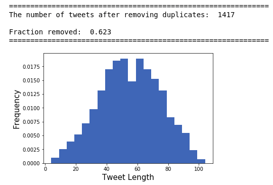
Duplicates were also removed from the data set. For any days with missing data, such as weekends for the stock market returns, the median was used. The histogram of the tweet length before the preprocessing steps is given in the figure below:
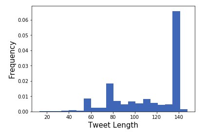
Many of the tweets contained URLS causing a large number of tweets to reach the 140 character limit.
After processing the tweets and removing duplicates the histogram looks more Gaussian:
Another issue in the data set was that for specific car brands, their tweets contained many topics not related to cars. To filter out irrelevant tweets, topic modelling was employed on the database. The topic modelling algorithms required an optimal value for the “number of topics” parameter in the prebuilt (latent dirichlet allocation or non-negative matrix factorization) functions used. The number of topics parameter (\(k\)) was determined by maximizing the average cohesion score for the top \(m\) ranked words that describe a specific topic. The cohesion function acts on a string by calculating the average cosine similarity score (using a prebuilt word embedding model from spacy ‘en_core_web_lg’) for all pairs of words in that string.
The python function which computes this string cohesion score is given below:
1
2
3
4
5
6
7
8
9
10
11
12
13
14
15
16
17
18
19
20
21
22
23
24
25
26
27
28
29
def string_cohesion(vec):
	'''
	This function will compute the cohesion of a vector of words. This function
	is useful for choosing the number of topics for topic modelling

	The function has the following bounds:

	0<= string_cohesion(x) <=1

	string_cohesion(x) = 1
	when x consists of the same words

	string_cohesion(x) = 0
	when x is an empty string or there are no tokens for it
	'''
	s=0.0

	tokens = nlp(vec)
	Norm = len(tokens)

	# If we have a non-zero norm
	if(Norm!=0):

		for word1 in tokens:
			for word2 in tokens:
				if(word1.has_vector==True and word2.has_vector == True):
					s+= word1.similarity(word2)
		s/=Norm**2
	return s
This function was used to find irrelevant topics in the twitter database, for example some car tweets were related to people warning each other about a police chase.
Preliminary Results
Finally after building the model, creating the AWS server to collect the tweets and cleaning the database, we conduct the statistical analysis. Using appropriate SQL queries, we processed the tweets of automotive brands on a day-by-day basis for the two-week period using different model thresholds. These day-by-day sentiments of the tweets are shown below for Tesla:
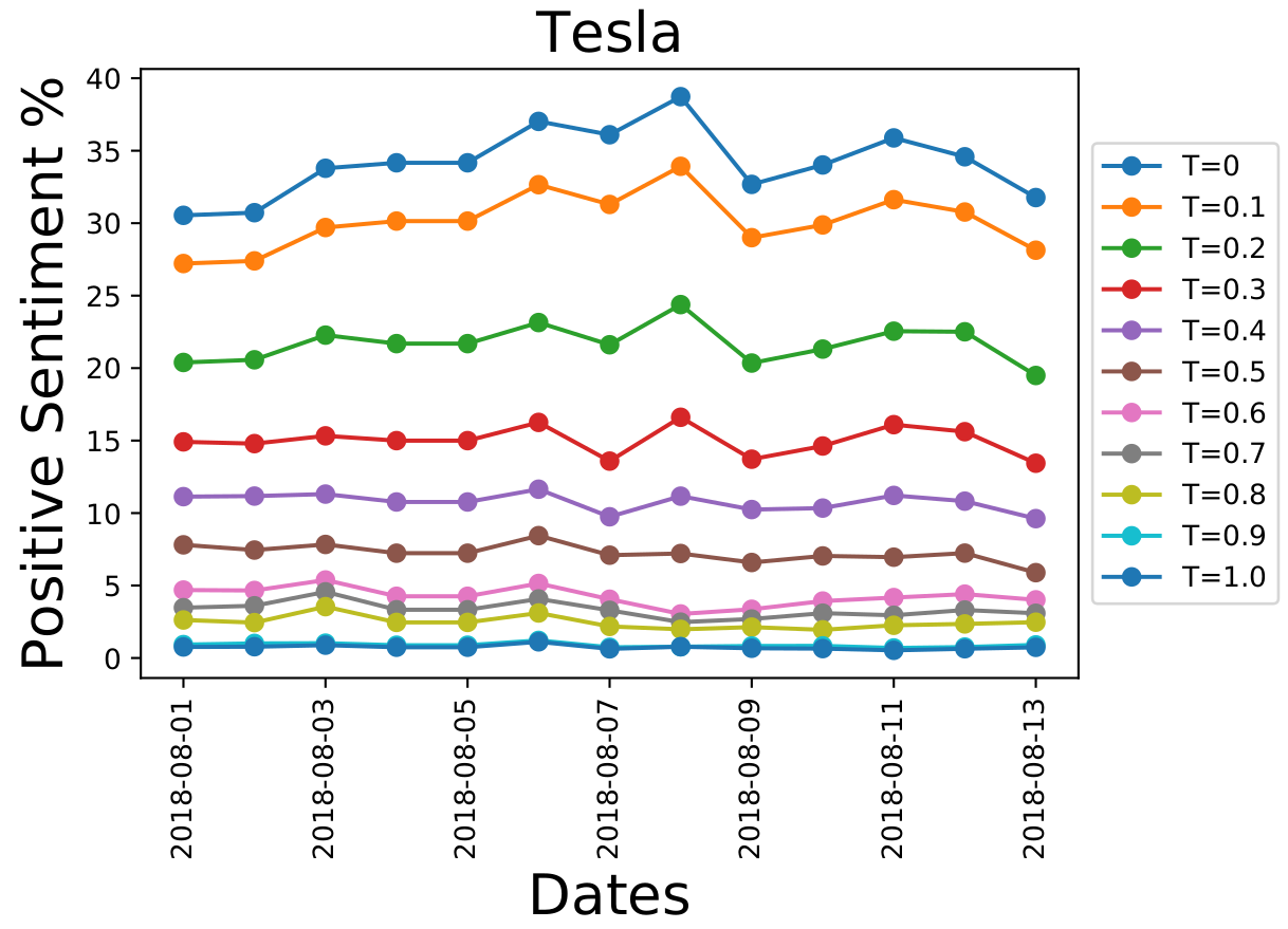
The \(y\)-axis represents the number of tweets related to Tesla, that were identified as being “positive” for a given day in the data set. There is a spike around August 8th for \(T=0\). As the prediction certainty threshold value (\(T\)) is increased, the strengths of these spikes decreases. Furthermore, the baseline number of positively identified tweets decreases as we the certainty threshold of the model is increased.
Combining the sentiment curves
In Fig. 5 there are specific peaks in the sentiment curves that do not vanish when the certainty threshold is increased. For example, on August 6th, there is a small consistent bump for all thresholds. Intuitively, this means that this signal is more important than others. These are the signals that we want to extract from the data. However, the curves for different \(T\) values have vastly different scales. The scale for the \(T=0\) curves have a baseline around 30%, while for \(T\)=0.8 the baseline is around 3%.
Another problem is that not all of the curves are to be taken with the same weight. The values with \(T=0\) carry less weight high \(T\) values. But how do we determine this weight for a given \(T\)?
So we are faced with two problems:
- Is it possible to remove the scale associated with the different thresholds?
- Once we have similarly scaled data, how can we combine the different curves together to get unique signal?
This first problem can be solved by normalizing the data. We chose to do this with the Z-transformation for each curve from the different thresholds, this will result in the set of curves
\[\\ \lbrace \text{Pos}(x_t,T), \text{Neg}(x_t,T) \rbrace \\\]for the positive and negative sentiment time series signals, where \(x_t\) represents the day and \(T\) the threshold.
Now we need to know how to combine them. The solution is inspired by Bayesian statistics. The positive and negative sentiment curves for different thresholds are combined into a final true positive and false positive curve, denoted \(P(x_t)\) and \(\tilde{P}(x_t)\), respectively, are written as
\[\\ P(x_t) = \int\limits_0^1 dT \ \text{Pos}(x_t,T)W_{TP}(T), \\\] \[\\ \tilde{P}(x_t) = \int\limits_0^1 dT \ \text{Pos}(x_t,T)W_{FP}(T). \\\]Where \(W_{TP}(T)\), \(W_{FP}(T)\) are the true-positive and false-positive weights at a given \(T\). They represent how seriously a given sentiment curve should be taken into account for a specific \(T\). Their exact expressions are
\[\\ W_{TP}(T) = P(\hat{y}=1|y=1,T)P(y=1|T)P(T), \\\] \[\\ W_{FP}(T) = P(\hat{y}=1|y=-1,T)P(y=-1|T)P(T). \\\]Here, the symbol \(\hat{y}\) represents the sentiment prediction of the model and \(y\) is the true sentiment. Therefore, \(P(\hat{y}=1|y=1,T)\) indicates the probability of a true positive, \(P(y=1|T)\) is the prior probability of positive tweets, and \(P(T)\) is the prior distribution for the threshold. (This last prior is taken to be a uniform distribution from 0 to 1)
Similar expressions hold for the true negative and false negative sentiment signals. For the incoming automotive tweets, the true distributions of positive and negative sentiments are not known. However, we will assume that the distributions obtained from the testing set will be the same (or similar) to the live automotive tweets. If the model has been well trained then we would expect our model to generalize and this assumption should be approximately correct. In the figure below the weight \(W(T)\) as a function of the threshold are plotted in dimensionless units.
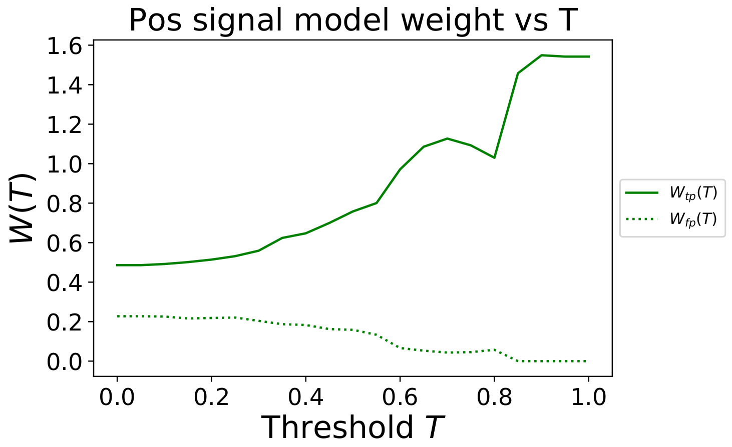
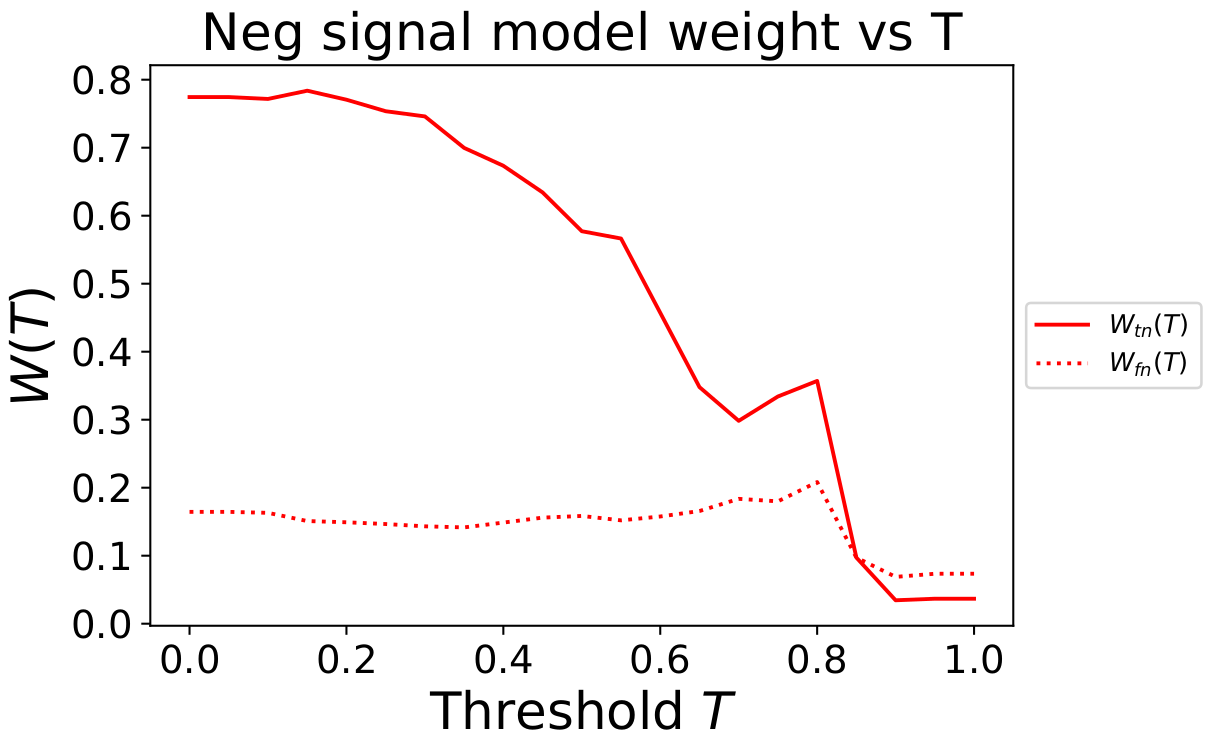
Fig. 6 shows that as the threshold value \(T\) increases, the positive sentiment time series prediction, \(\text{Pos}(x_t,T)\), for that threshold is weighted more heavily.
In contrast, in Fig. 7 as the threshold value \(T\) increases, the negative sentiment time series prediction, \(\text{Neg}(x_t,T)\), for those thresholds is weighted much less.
This indicates that our ensemble model is not good at making confident predictions about negative sentiment tweets, but it does seem to do well at understanding which tweets are positive. Therefore, when combining predictions for different thresholds it considers high confidence positive sentiment signals with more weight, while ignoring the high confidence negative sentiment signals.
Using the Bayesian weighting average formula found earlier, we calculate the normalized positive and
negative sentiment signals. The one for Tesla during the two-week period is shown below
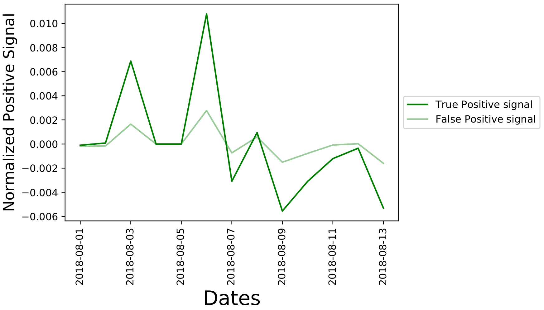
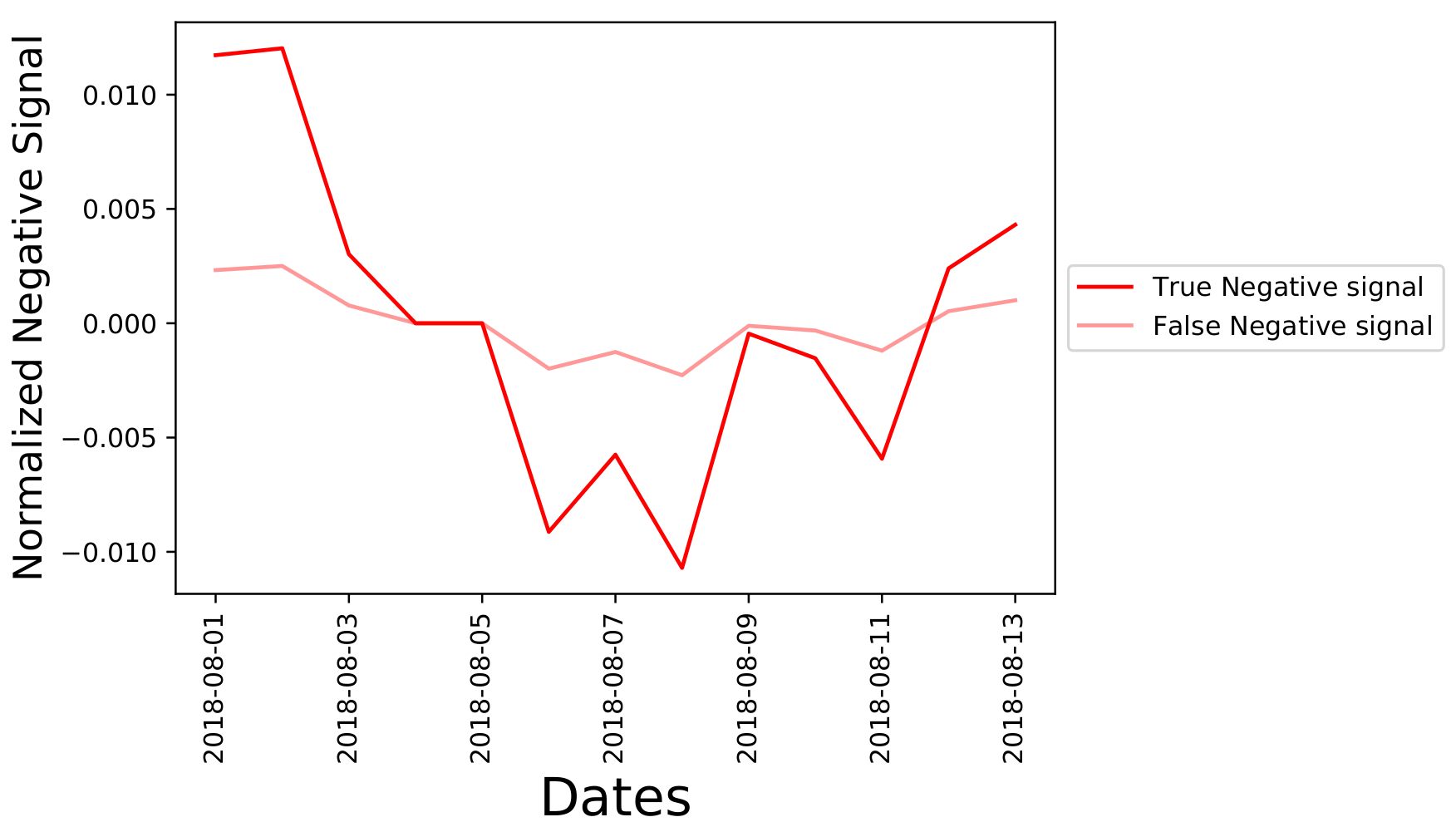
Figure 8 indicates a signal spike for August 3,2018 and August 6, 2018 indicating a large number of positive tweets in the data set for Tesla during those two days. In the next section, we will analyse this data within a financial framework to examine correlations between these sentiment signal time series and the return of the stocks for vehicle brands.
Analysing stock returns and sentiment signals
Now that the data is normalized and the curves at different thresholds have been combined together into a single sentiment signal time series, we want to analyse the correlation between this time-series and the stock return time series. However, the next problem that we encounter is:
- how can we relate the sentiment signals to the return of the stock?
There is a financial model, known as the CAPM(note we use 0 for the risk free return rate) that relates the return of an asset to the return of the market through a linear model. The base CAP model states that the return of a stock \(r\) should be proportional to the return of the market \(r_{M}\) by
\[\\ r(x_t) = \alpha + \beta_{M} r_{M}(x_t). \\\]Here the proportionality constant to the market is \(\beta_M\), \(\alpha\) is a small offset and the parameter \(x_t\) represents the day. This base hypothesis can be extended to include additional coefficients \(\beta_P\) and \(\beta_N\) that allow the inclusion of the effects of the positive and negative sentiment signals from Figs. 8 and 9 through a generalized linear multifactor model
\[\\ r(x_t) = \alpha + \beta_{M} r_{M}(x_t) + \beta_{N} N(x_t) + \beta_{P} P(x_t). \\\]A Bayesian linear regression analysis was conducted to determine the distributions of the linear fit coefficients. In the Bayesian framework, we need to determine the posterior distribution of a parameter \(\beta\) given the times series data, denoted \(D\). This posterior distribution is denoted \(P(\beta|D)\).
This Bayesian fitting was carried out using the emcee Python package, that employs a parallelized Markov chain Monte Carlo algorithm to compute the posterior distributions of the parameters of the fit from a likelyhood function. Mathematically speaking we are carrying out the integrals given by
\[P(\beta_P|D) \propto \int d\sigma \int d\beta_M \int d\beta_N \int d\alpha \ P(D | \alpha,\beta_N,\beta_P, \beta_M,\sigma)P(\beta_P)P(\beta_M)P(\beta_N)P(\sigma),\\ P(\beta_M|D) \propto \int d\sigma \int d\beta_P \int d\beta_N \int d\alpha \ P(D | \alpha,\beta_N,\beta_P, \beta_M,\sigma)P(\beta_P)P(\beta_M)P(\beta_N)P(\sigma),\\ P(\beta_N|D) \propto \int d\sigma \int d\beta_P \int d\beta_M \int d\alpha \ P(D | \alpha,\beta_N,\beta_P, \beta_M,\sigma)P(\beta_P)P(\beta_M)P(\beta_N)P(\sigma), \\\]where the likelyhood function of the data given the model is
\[\\ P(D | \alpha,\beta_N,\beta_P, \beta_M,\sigma) = \text{Exp}\left( - \frac{1}{2\sigma^2}\chi^2 \right), \\\]here \(\sigma\) is the width of the distribution and \(\chi^2\) is the least square residuals between the linear model and data.
The priors of the parameters \(P(\beta_{N})\), \(P(\beta_{M})\), \(P(\beta_{P})\), \(P(\alpha)\) are uniformly distributed in the range (-100,100). The prior \(P(\sigma)\) is a scale invariant Jeffreys prior. We calculated the posterior distributions for all 5 car brands. The distribution for the coefficient \(\beta_P\) for Tesla is shown below,
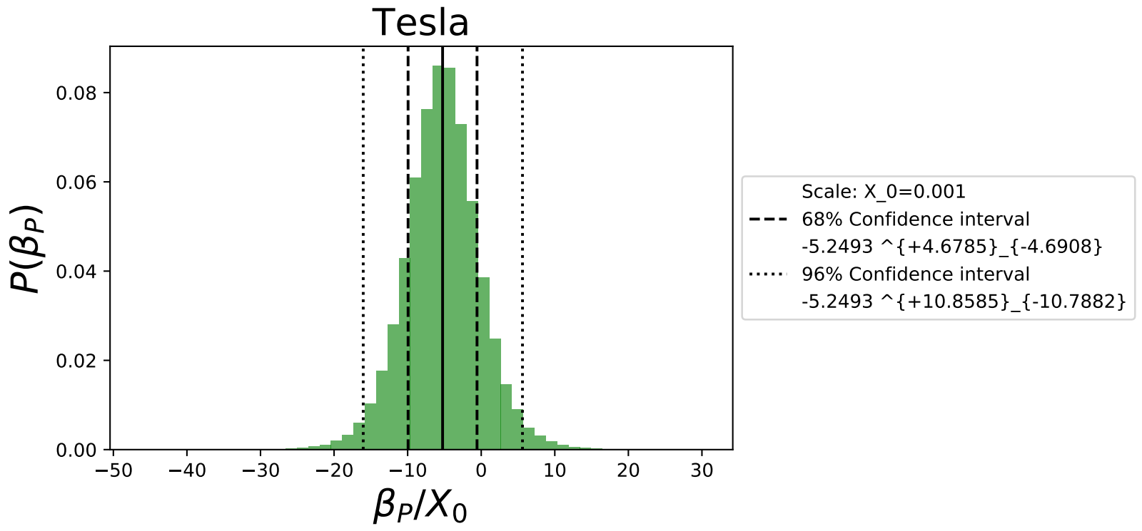
Fig. 10 gives the median value of \(\beta_P\) of the model as well as the 68% and 96% confidence intervals. These confidence intervals demonstrate the power of using the Bayesian linear regression to quantify uncertainty. We observe that while the median value of the fit is negative and excludes zero at the 68% confidence level, there isn’t enough statistical power to exclude 0 at the 96% confidence level. In a future post we will revisit this analysis with a larger data set.
Based on the determined median values of the \(\beta\) parameters in Fig. 11, we summarize the correlations that were not excluded at the 68% confidence level for the 5 investigated car brands.
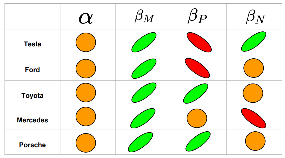
Green indicates a positive trend, red a negative trend, and orange means the correlation was excluded at the 68% confidence region.
The main findings of this table are:
-
For all examined vehicle brands, the median value of \(\beta_M\), representing the sensitivity of the market return to the stock return was always positive and seemed to be the strongest effect of the linear model.
-
The stock returns for Tesla are positively correlated with negative twitter sentiments
-
The stock returns for Toyota and Porsche are positively correlated with positive twitter sentiments
-
The stock returns for Tesla and Ford are negatively correlated with positive twitter sentiments
-
The stock returns for Mercedes are negatively correlated with negative twitter sentiments
In future work, it would be useful to investigate the underlying reasons for the correlations. It is counter intuitive that positive tweet sentiments are anti-correlated with the return of the automotive stocks for some companies.
Posteriors of the correlations
The results of the last section give the general “sign/direction” of the correlations, but not the numerical strengths. The next task is to compute the posterior distributions of these correlations. The Pearson’s coefficient between time series \(x\) and \(y\) is
\[\rho(x,y) = \frac{\sum\limits_{i}^N (x_i-\bar{x})(y_i-\bar{y})}{(N-1) s_x s_y}, \\ s^2_{x} = \frac{1}{N-1}\sum\limits_{i}^{N} (x_i-\bar{x})^2, \\ s^2_{y} = \frac{1}{N-1}\sum\limits_{i}^{N} (y_i-\bar{y})^2.\]where \(N\) is the number of data points (or days). Here \(\bar{x}\) and \(\bar{y}\) are the mean values of the time series. The correlation coefficients that investigate are
\[\rho(M,r) = \text{ The correlation coefficient between the market return and the stock return of the brand}, \\ \\ \rho(P,r) = \text{ The correlation coefficient between the positive sentiment signal and the stock return of the brand},\\ \\ \rho(N,r) = \text{ The correlation coefficient between the negative sentiment signal and the stock return of the brand}.\]The posterior distribution of \(\rho(P,r)\) for Tesla is shown in Fig. 12 below
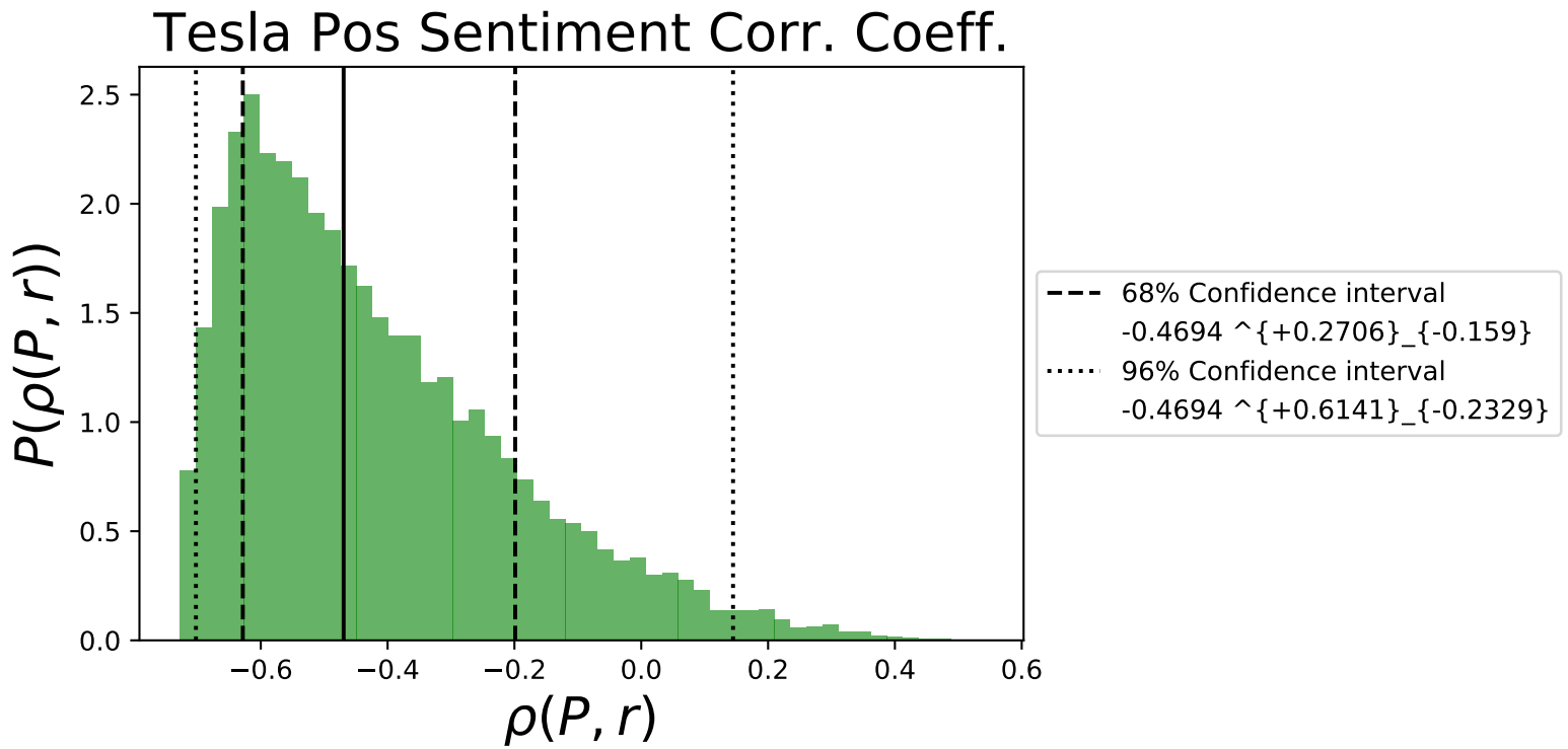
Fig 12. shows that there is a minimum correlation coefficient that is possible for the data set, at around -0.7 for Tesla,
and most of the distribution is centered around negative values as indicated by the \(\beta_P\) value in Fig. 10.
We summarize the median values of all correlations in Fig. 11.

Conclusions and further work
In this article, we focused more on the mathematical details and the methodology constructed with python that allowed us to carry out the end-to-end data science project. The main limitation of our work was the small data set that was used to compute the correlations. We found correlations at the 68% confidence level, but they may yet be excluded at the 96% confidence region. However, this proof-of-principle project produced interesting results and provides us the tools for future investigations. In the next upcoming blog post, we will use a large data set, with several months worth of data to study the model proposed here. In that upcoming post we will examine in detail the following effects:
- How do the sentiment correlations change as a function of time?
- What are the results of using a sliding window approach for the correlations?
- Does changing the normalization method change the correlations? For example using a min-max scaler as opposed to the Z-transformed data?
- What are the results when we include/remove outliers in the data set?